Burro Bar Poster

Image

My neighbor works with Burro Bar in Downtown Jacksonville with their marketing and promotions. She has been creating band posters for their upcoming shows for a while now, but wanted to change it up. Instead of creating an individual poster for each band, she wanted to make a weekly schedule poster that lists them all. She got off to a good start with the concept, but just needed help with the design.

Here is the final poster that was approved. This was created entirely in Photoshop using basic text and shapes, and Burro’s official logos.

Burro_JanUpcomingShows

Jowers Brewing

Standard

Half a Hundred Label w HopsMy husband and I have close friends who recently began home brewing for a new hobby. My husband automatically offered his help with the brewing side of it, but I wanted to assist their project in some way too. That’s when our friend’s wife said she was thinking of creating labels for the beer and having them printed – that was it! Once I heard the name of the first beer, I had a grand idea in mind and got working. Continue reading

Magazine Article Re-Creation

Standard

Barbie logoAnother required class for the advertising program is Advertising Media Graphics. This is the intro design class for the program, and covers Adobe Photoshop and InDesign. One of the InDesign projects asked us to find an article, any article, written in the last 30 days, that we would use as content for a magazine spread. The layout and design was to be totally original, just the copy was used from the original article. Some of the skills and functions used in this project were character styles, paragraph styles, baselines grids and advanced use of text wrapping. Continue reading

Social Media

Image

Social media is a tremendous growing industry, literally updating everyone’s lives to an exciting level.  I have always been attracted to the digital side of marketing, but also wanted to be involved in the guerrilla movement of social media. This position with Media Mix gave me that. I believe that social media is a very strong tool, and with the proper etiquette and creative thinking, can be world impacting.

One way to attract your viewers is through imagery. We like to try to use images in most of our posts as to catch the viewers eye. Especially in today’s world, the format that Instagram created is what Facebook has essentially turned into – it is no longer a social network but a photo sharing platform, only better. The artwork below are pieces that I made for Facebook, a newsletter or web banners. I used Adobe Photoshop, InDesign, and a free website called Pixlr.

This slideshow requires JavaScript.

Women in Business Society

Standard

WIB-_logo2LG

Last semester, I interviewed for and got the position for Marketing Chair for a student organization on campus called the Women in Business Society. This group is based out of the Coggin College of Business, however, obviously you don’t need to be a business major to be a member. Our main goals for the society is to educate and connect our members with the professional community in Jacksonville. We participate in many different volunteering opportunities and help our members with career planning, interview skills, and more.

As marketing chair, my main duties are to design the fliers/posters for our meetings and events, promote those designs across campus and our social media accounts, to which I monitor and play with. WBS has accounts for Facebook and LinkedIn, as well as a new Twitter account that I created for the group.

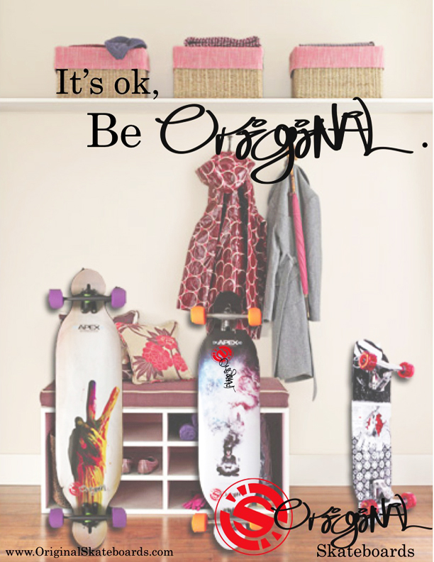
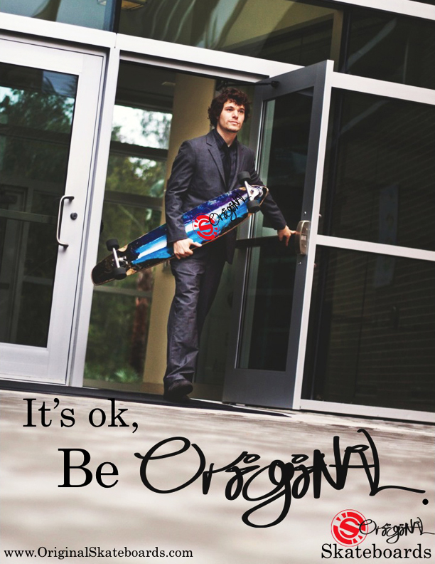
Below is a gallery of the many fliers and posters I have created so far for WBS. The group traditionally uses the services of Vistaprint to create their fliers. However, as an advertising major, I have been attempting to use the Adobe programs as much as possible to help myself and create more original images for WBS.

This slideshow requires JavaScript.

My next major project with WBS is our upcoming annual Spring Forum. Forum is a full day’s event where we invite many, many speakers, representatives and professionals from different industries to network with our society and campus community. For the forum, we have invited Donna Orender, former president of the WNBA to be our keynote speaker. Alongside her, there will be three different breakout sessions with panels that the professionals mentioned above with sit on. Our members and guests will get the chance to discuss a variety of topics with these leaders, and then attend a networking social with them after the forum.

This is an event that we take great pride in as a society, and is something we work towards all year long. My position as marketing chair slips over to forum where I will help with creating ground signs, brochures/programs, event cards, invitations, table tents, signs and more. After the forum, I will include some examples of those marketing materials in a new post.

Original Skateboards Magazine Ads

Standard

As promised, I have finally provided the final draft magazine ads for Original Skateboards that my agency Wonder+ created last semester. In wanting to practice my skills of Photoshop and Indesign, I tried working on the ads first before sending it to my team for touch-ups.  For example, this first, family-looking ad, I used Photoshop to insert the skateboards in to the image of the entry way. One of my team members, Adam Lankford, edited those changes and added the copy and logos.

Original Family

As for the Businessman ad, our team member Courtney Boydston is an aspiring photographer and spent a good amount of time working with Ricky Horton, the actor, on getting the perfect shot. We chose this shot because of the great negative space to place copy and logos, as well as it being an interesting angle. Overall, we were pretty simple in the ads, but complex in the concept and branding for this campaign.

 Original Businessman

Original Skateboards Campaign

Standard

wonder +

Throughout my Principles of Advertising course, I have been working with my first ad agency – wonder+ advertising. This agency is my class group in which we came up with a agency name, type of agency, individual positions and titles, and it all culminated in a brand analysis and campaign.

Our agency fought a bit over which brand we would choose to represent, but eventually we came up with Original Skateboards. This product and brand was perfect because it allowed our already creative and experienced agency a chance to branch out.

Our agency created three different ads for this project. Not one person worked on them all. Every one of us contributed to each ad. The last two, titled Urban Savvy Businessman and Family Longboarders

were the two we used in our campaign. They will be uploaded to this post soon.

Our final presentation went better than I thought it would. We each chose to wear a piece of red clothing to represent the brand’s colors. We knew our parts well, we executed passing the clicker during the presentation and were under our time limit. We received A’s for the project as a whole! If you’d like to see the presentation, you can find it here.

We went the extra mile with wonder+. We not only created our own website, but also a twitter account and now have a portfolio! You can learn more about our agency by going to our site here. Take the Wave With YouUrban Savvy Businesman

Photoshop Exercise

Standard

On October 8, we began working in Adobe Photoshop. We spent some time going through some basic key functions and tools. We then were given an assignment to create an advertisement. The start of the assignment was a Photoshop document that had images of salad toppings, a cutting board, and a text image.

To move the salad toppings onto the cutting board we used the object selection tool, the magnetic lasso tool, and the magic wand tool. After each object was positioned on the cutting board, we used the quick selection tool to select each object and place it on its own layer. Once each layer was created, we went to the first layer (example: carrot) and created a layer effect. We added drop shadows to each layer, so that every object on the cutting board has a soft shadow.

We then altered the image to be a flatten image, converted the colors to CMYK form, and it’s done! This was our first exercise in Photoshop, which is a practice for tools that we will need for our final Photoshop project. Coming soon!

Editing Isn’t All Good, All the Time

Standard
Emma Stydahar and companions at a mock fashion show  protesting Teen Vogue's model retouching.

Emma Stydahar and companions at a mock fashion show protesting Teen Vogue’s model retouching.

No one can argue that creating the perfect atmosphere, timing, lighting, movement, etc. is an easy task. Photographers, creative directors, set designers and producers all work the best they can with what naturally comes by. That includes making sure outdoor photos aren’t darkened from a cloud-covered sun, or that the wind makes a model’s scarf move just slightly, not obstructing any faces. Editors, photographers, models, art directors and more all want the perfect shot, spread, cover and publication. In the digital age, obtaining that perfection has become more than easy- but at a cost. Continue reading