 My husband and I have close friends who recently began home brewing for a new hobby. My husband automatically offered his help with the brewing side of it, but I wanted to assist their project in some way too. That’s when our friend’s wife said she was thinking of creating labels for the beer and having them printed – that was it! Once I heard the name of the first beer, I had a grand idea in mind and got working. Continue reading
Adobe InDesign
I Now Pronounce You…
Standard
Recently, there was a particular project that I spent more time on than anything else in my life – my wedding. As a girl’s dream come true, my prince proposed and it was my turn to plan! When it came to my invitations, I knew that there was no way I would be able to just pick out any design in stores or online – I knew that I wanted them custom for me, by me. So, during my busiest year yet, I designed Save the Dates, the Invitations and Enclosure cards and the day-of Programs. My mother-in-law gratefully knew a wonderful local printer who offered to help with the printing, and I was able to pick out beautiful white linen paper for everything. All-in-all, I was very pleased with the result and got many compliments from friends and family! Continue reading
Magazine Article Re-Creation
Standard![]() Another required class for the advertising program is Advertising Media Graphics. This is the intro design class for the program, and covers Adobe Photoshop and InDesign. One of the InDesign projects asked us to find an article, any article, written in the last 30 days, that we would use as content for a magazine spread. The layout and design was to be totally original, just the copy was used from the original article. Some of the skills and functions used in this project were character styles, paragraph styles, baselines grids and advanced use of text wrapping. Continue reading
Another required class for the advertising program is Advertising Media Graphics. This is the intro design class for the program, and covers Adobe Photoshop and InDesign. One of the InDesign projects asked us to find an article, any article, written in the last 30 days, that we would use as content for a magazine spread. The layout and design was to be totally original, just the copy was used from the original article. Some of the skills and functions used in this project were character styles, paragraph styles, baselines grids and advanced use of text wrapping. Continue reading
Social Media
ImageSocial media is a tremendous growing industry, literally updating everyone’s lives to an exciting level. I have always been attracted to the digital side of marketing, but also wanted to be involved in the guerrilla movement of social media. This position with Media Mix gave me that. I believe that social media is a very strong tool, and with the proper etiquette and creative thinking, can be world impacting.
One way to attract your viewers is through imagery. We like to try to use images in most of our posts as to catch the viewers eye. Especially in today’s world, the format that Instagram created is what Facebook has essentially turned into – it is no longer a social network but a photo sharing platform, only better. The artwork below are pieces that I made for Facebook, a newsletter or web banners. I used Adobe Photoshop, InDesign, and a free website called Pixlr.
Creating a Direct Mailer w/ InDesign
Standard
The final project assigned in my Basic Computer Images course was one for Adobe InDesign. We were required to think of a service, event, business or some other topic and create a direct mailer with that information. It was to be created on InDesign and have at least one fold in the piece. I went with my involvement in the Women in Business Society to create a flyer for our upcoming Spring Forum. I knew I could easily get the information, and what was better, we might actually look into using these to mail out as marketing for the forum!
The number one obstacle that needed to be jumped was learning the viewpoint on InDesign and how to reflect that to what you are trying to accomplish. My professor gave us the help of asking us to use a regular sheet of tabloid paper and create a “mock-up” of our brochures. This way, we can physically see how it need to fold and how the information needs to be arranged, and from what angle. Once we figured this out, we created the document in InDesign, noting the Facing Pages and making it 2 pages that will be printed duplex. We used the guides in the program to create our fold lines so we knew our boundaries, and then created margins and bleeds that we wanted to use. All that was left was filling it in with information!
My brochure included one folded side where the actual mailing information would be located. The other side of that would include all our sponsors. Once opened to the half size, it displayed the key general information about the event. The full inside spread became a poster that could be displayed around the campus or town. Images of the first page, being the outsides, and the second page being the inside poster, are included below.
This assignment was very helpful to me for many reasons. I learned more about using multiple pages and layout, which I have always been interested in. I played with rotating the views to create different effects and arrange the information in the way easiest to read the brochure. I was able to create an entire poster for an event, my first ever. I played not only with InDesign, but with Illustrator to create the text boxes and logo. This was a very beneficial assignment overall for me.
For a link to a PDF version of my WBS Spring Forum 2013 direct mailer, click here.
Women in Business Society
Standard
Last semester, I interviewed for and got the position for Marketing Chair for a student organization on campus called the Women in Business Society. This group is based out of the Coggin College of Business, however, obviously you don’t need to be a business major to be a member. Our main goals for the society is to educate and connect our members with the professional community in Jacksonville. We participate in many different volunteering opportunities and help our members with career planning, interview skills, and more.
As marketing chair, my main duties are to design the fliers/posters for our meetings and events, promote those designs across campus and our social media accounts, to which I monitor and play with. WBS has accounts for Facebook and LinkedIn, as well as a new Twitter account that I created for the group.
Below is a gallery of the many fliers and posters I have created so far for WBS. The group traditionally uses the services of Vistaprint to create their fliers. However, as an advertising major, I have been attempting to use the Adobe programs as much as possible to help myself and create more original images for WBS.
My next major project with WBS is our upcoming annual Spring Forum. Forum is a full day’s event where we invite many, many speakers, representatives and professionals from different industries to network with our society and campus community. For the forum, we have invited Donna Orender, former president of the WNBA to be our keynote speaker. Alongside her, there will be three different breakout sessions with panels that the professionals mentioned above with sit on. Our members and guests will get the chance to discuss a variety of topics with these leaders, and then attend a networking social with them after the forum.
This is an event that we take great pride in as a society, and is something we work towards all year long. My position as marketing chair slips over to forum where I will help with creating ground signs, brochures/programs, event cards, invitations, table tents, signs and more. After the forum, I will include some examples of those marketing materials in a new post.
Original Skateboards Magazine Ads
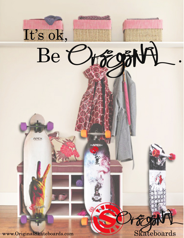
StandardAs promised, I have finally provided the final draft magazine ads for Original Skateboards that my agency Wonder+ created last semester. In wanting to practice my skills of Photoshop and Indesign, I tried working on the ads first before sending it to my team for touch-ups. For example, this first, family-looking ad, I used Photoshop to insert the skateboards in to the image of the entry way. One of my team members, Adam Lankford, edited those changes and added the copy and logos.
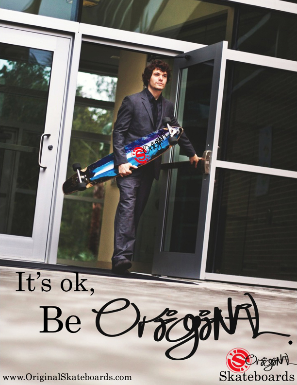
As for the Businessman ad, our team member Courtney Boydston is an aspiring photographer and spent a good amount of time working with Ricky Horton, the actor, on getting the perfect shot. We chose this shot because of the great negative space to place copy and logos, as well as it being an interesting angle. Overall, we were pretty simple in the ads, but complex in the concept and branding for this campaign.
Object Illustration Project
StandardThis semester, I am enrolled in a course called Basic Computer Images. It focuses on learning the Adobe Creative Suite: Illustrator, InDesign, and Photoshop. This was my first time really working with the Mac/Apple user face and software. I’ve used Microsoft Word on a Mac before, but never thoroughly used a Mac. So the first program that we started with is Illustrator. We went through basic functions and tools. Some of our first assignments involved using the Pen Tool and making Bézier Curves. We used worksheets as templates in Illustrator and make curves and straight lines, then combined them both to create outlines and fills of various shapes.
Our first project was entitled Object Illustrations. The process was to first sketch out a scene or image that meant something to us. Maybe our favorite place, or instrument, or to basically illustrate something that we enjoy or take pride in. I looked to the easiest inspiration for me: music and writings. I love finding a great lyric in classic songs, or an engaging quote or poem. My all time favorite quote is from Shakespeare’s Twelfth Night. In Act 1 Scene 1, Duke Orsino starts by saying “If music be the food of love, play on;”. I find music to be influential in a person’s life, because every one finds a different meaning in the same words or notes, and its common for us to attach ourselves to songs or lyrics because they make us feel or think about something sentimental to us. Personally, any song or lyric that makes me think of my long-term boyfriend, I remember it. So this line from Shakespeare has stayed with me since high school.
From this line, I imagined a romantic scene in the woods, where there are candles and musical instruments and a bottle of wine and such. So that is the scene I sketched out and used for my image. For the assignment we were required to create multiple sketches and then incorporate them into one final image. I used tracing paper and made 2 separate layers: a tree background layer, and another that had the objects that will be on top the table. I then scanned these into the computer and placed each one on Illustrator under separate layers.


That was the easy part. The next steps included tracing each layer using the Pen Tool. That involved making shadows for the bottom of the trees, creating a dense forest look with the branches and leaves, and of course, all the objects on the table.Throughout the tracing, colors were a major step. Including finding shadow colors, and creating gradients for some objects like the wine bottle. The last piece that I worked on were the music sheets, love letters, and the ground color. I made a gradient for the ground so that it would fade to black, to the distance in the woods. Then it is finished!
Once done, we saved the Illustrator document to a EPS, which is an Encapsulated Post Script. We then opened InDesign, placed the EPS document and created a small text box to include my name on my image. From here, we created a Package of our images, which included the font we used, the links for the Illustrator document, and a PDF of the image. Final step in this 3 week long process was printing and presenting!
Overall, I was a little nervous at first, attempting to successfully create my first Adobe image. But after working consistently, I became familiar with the tools and processes in the program. I am pretty proud of my work, and very eager to begin making new images and artwork. Below is a pdf of the final image!
